New Destination Brand for Galway
The Challenge
Galway City Council and Galway County Council, in partnership with Fáilte Ireland, commissioned Bua & Revert Design to develop a new tourism brand to represent Galway, for the first time, as a unified destination.
Many different tourism brands were promoting Galway as a destination were confusing visitors and were of little benefit to the visitor or to Galway in terms of providing the correct positioning and information about Galway.
The newly developed brand proposition needed to reinvigorate Galway in the eyes of its potential visitors, to close the gap with Galway’s competitor cities.
This new brand proposition had as its objectives the promotion of Galway as a destination and to support the development of tourism experiences in Galway.
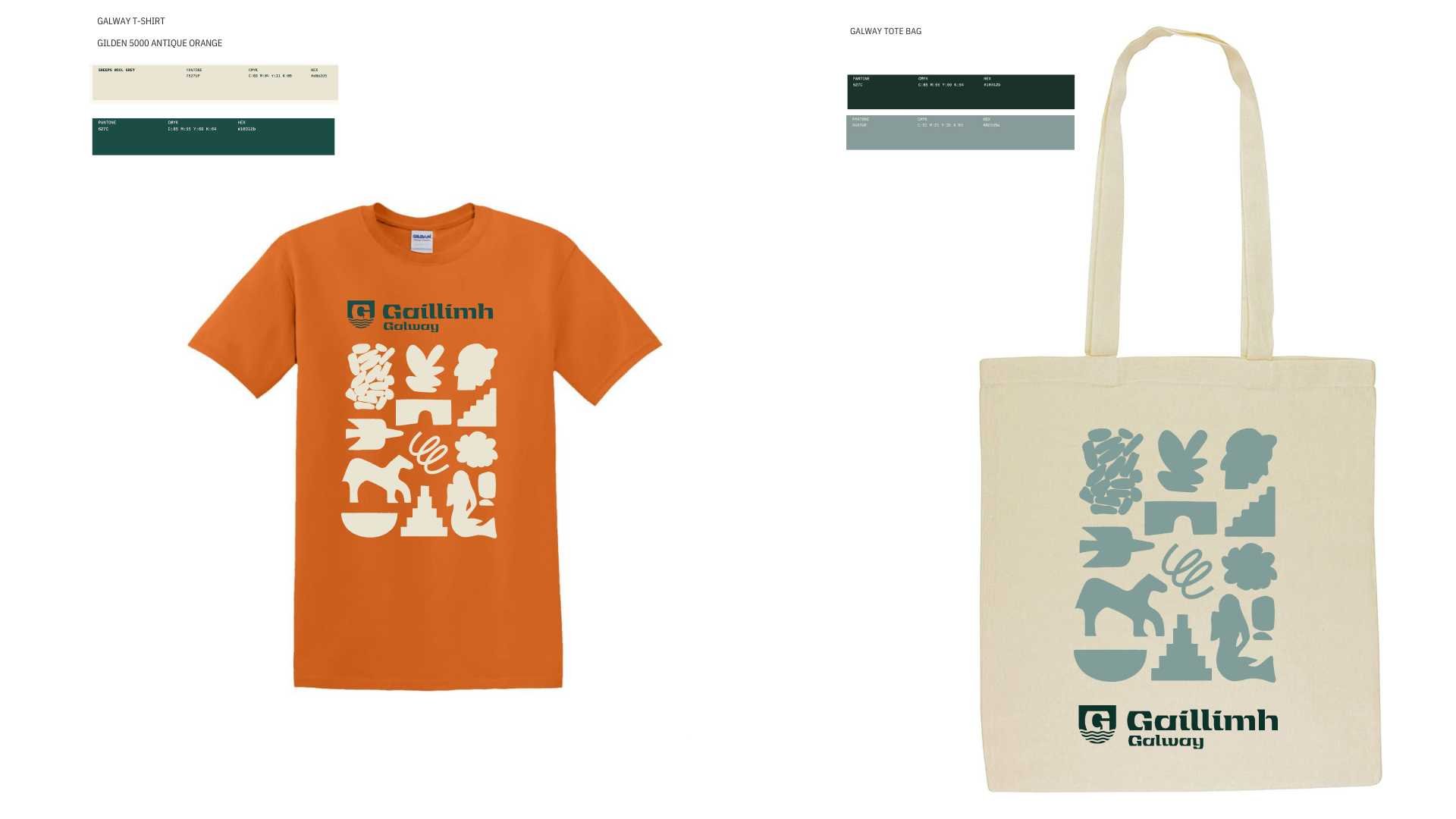
The importance of the Irish language to Galway as a destination was demonstrated in creating a 'Gaeilge-first' approach to the brand with the 'Gaillimh-Galway' typography.
The Solution
This was a multi-strand project involving considerable stakeholder consultation and on site familiarisation to ensure Galway’s tourism industry had a voice in the future unified brand.
The consultation phase included:
Facilitated workshops with industry groups to consult on the positioning, brand story and key USPs to include with the new brand.
A bilingual industry questionnaire to consult with the wider Galway tourism industry
The design discovery phase included a review of all existing tourism brands representing Galway and destination assets and market research into competitive brand and best practice destination marketing brands internationally.
The outputs from the consultation and design discovery phases led to developing a new brand story for Galway.
The project also included the development of a brand implementation guide and SMART action plan for the brand’s activation.
A New Design Approach
Bua collaborated with Revert Design on all design elements of this project who led the brand design.
One of the most exciting ideas for the new brand identity was to use the Jarlath typeface drawn by Max Phillips, at the Dublin-based Signal Foundry. It is based on an earlier font called Tuam Unical, drawn by legendary Irish designer Jarlath Hayes, and was used heavily in Ireland throughout the 1970s and 1980s (Remember the Glenroe opening titles?).
The brand application pack included several brand application examples and a proposed website brief.
Gaillimh | Galway New Visual Identity
Gaillimh | Galway New Visual Identity
Galway Destination Brand Application Examples
Results
The project resulted in the development of a new contemporary destination brand for Galway, rooted in its language, heritage and culture.
The new brand story focused on the key destination assets that aligned with the key tourism strategies for the destination, including the key destination brand of Fáilte Ireland’s ‘Wild Atlantic Way’.
Much more than just a logo; the new Gaillimh | Galway destination brand is a framework to position Galway as one destination to domestic and international audiences.

